Building Systems, Shaping Stories
Cross-platform system strategy and content that connects


At Alaska Airlines, I led the creation of the Auro Design System, shaped by the company’s renewed brand identity and built to perform across digital platforms. That foundation became critical as the airline navigated COVID, rapid growth, and key integrations. It gave teams a shared language to move fast while staying grounded in the brand.
I’ve worked hands-on and led teams across both systems and content design. I’ve written UI copy, shaped naming conventions, and partnered with brand to craft headlines and campaigns that feel timely, human, and culturally relevant. I’ve restructured transactional flows to bring empathy and clarity to moments where timing and tone matter most.
At Disney, I lead teams responsible for building tools and systems used by on-set crews, legal and marketing teams, and studio executives. We also support experiences for fans and audiences, where cohesion and functionality have to hold up at scale. Balancing those needs means building systems that are not only efficient, but speak with a clear and trusted voice.
01 Alaska Airlines Design System
The Opportunity
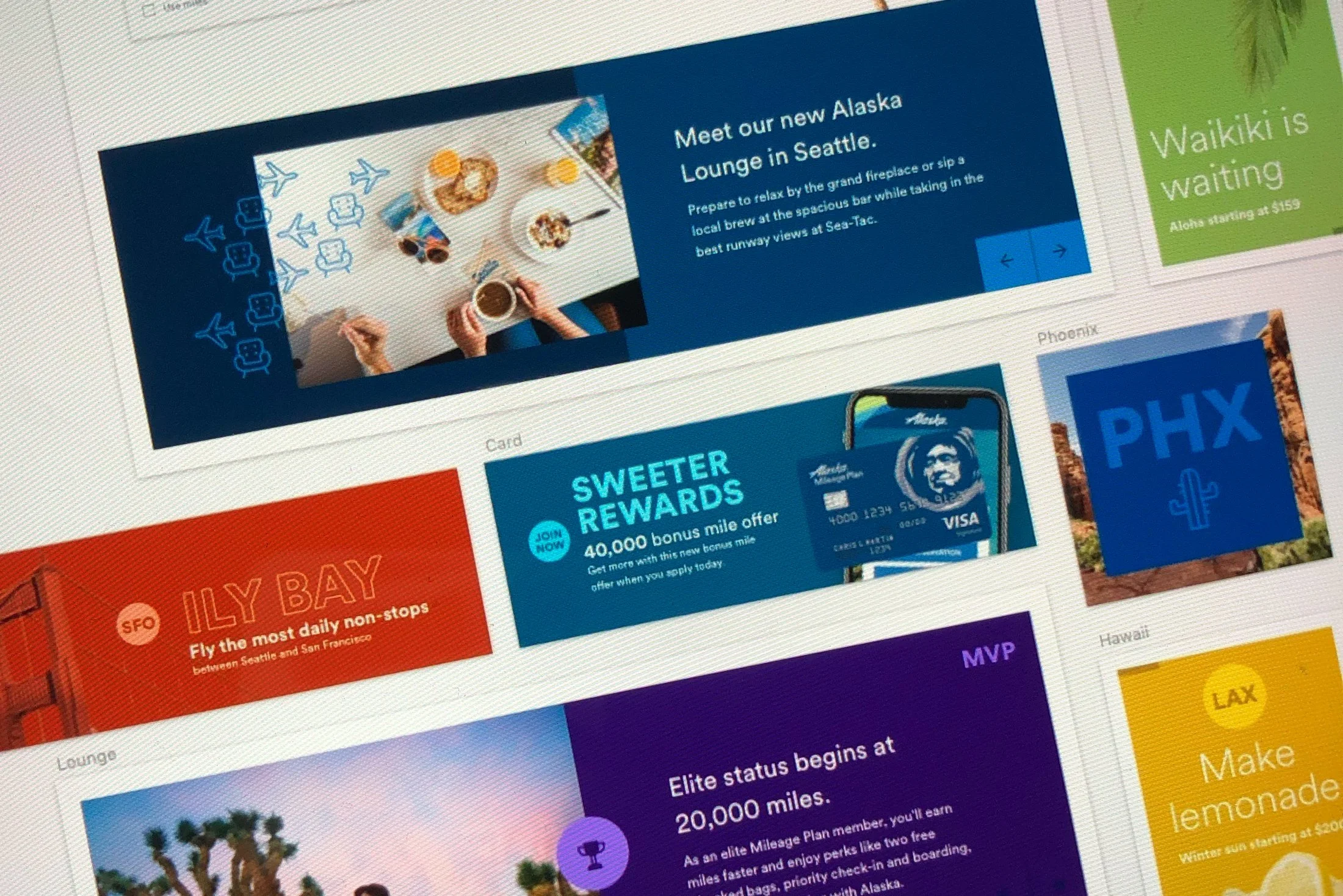
Alaska Airlines was gaining national momentum following its acquisition of Virgin America and a refreshed brand identity. While the marketing team had carved out a strong, modern presence, the digital experience was inconsistent, fragmented, and disconnected from the evolving brand. Design efforts were siloed, and the absence of a cohesive system made scaling difficult. With expansion on the horizon and major product updates underway, the company needed a centralized source of truth to align all digital touchpoints.
The extended digital color palette was a critical first step in bringing cohesion to our ecosystem. Inspired by high-impact brand moments like billboards, social posts, TV spots, and flight attendant uniforms, it infused personality and consistency into our website, apps, kiosks, and airport screens. This foundational move built trust with brand and marketing, secured executive buy-in, and set the stage for a scalable design system that carried our tone and identity across every screen.

Process / Governance Model

Process / Component Audit
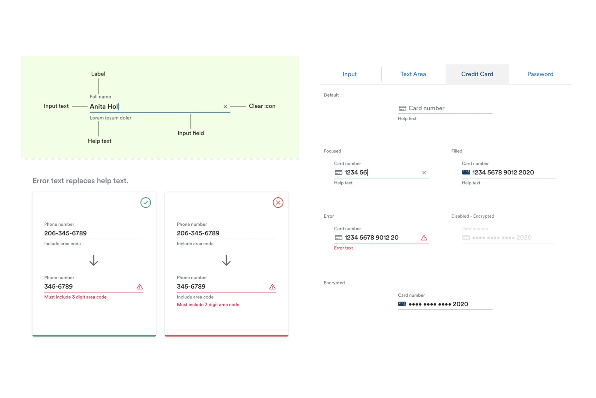
Components / Input Fields

Foundations / Type Ramp

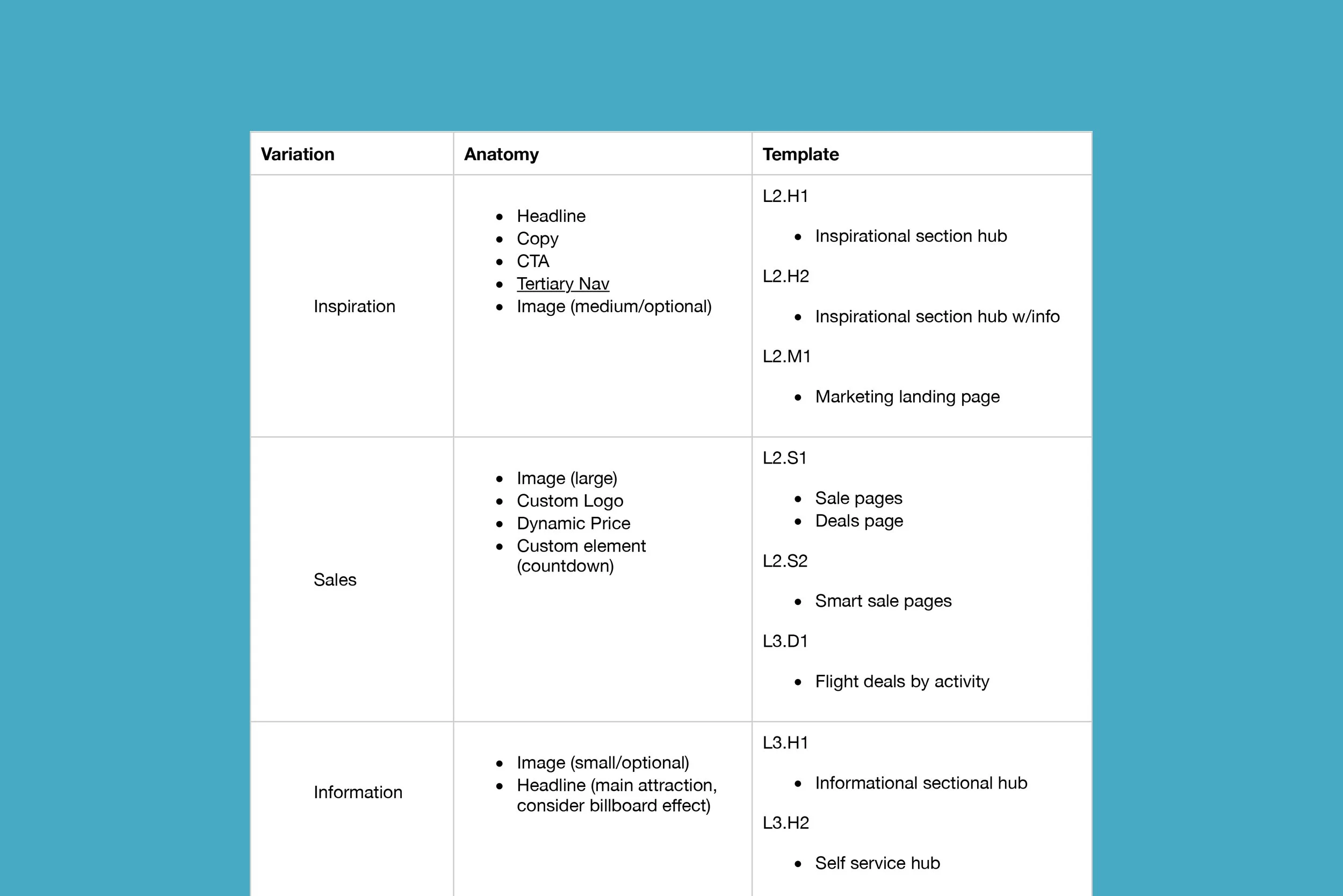
Component Overview
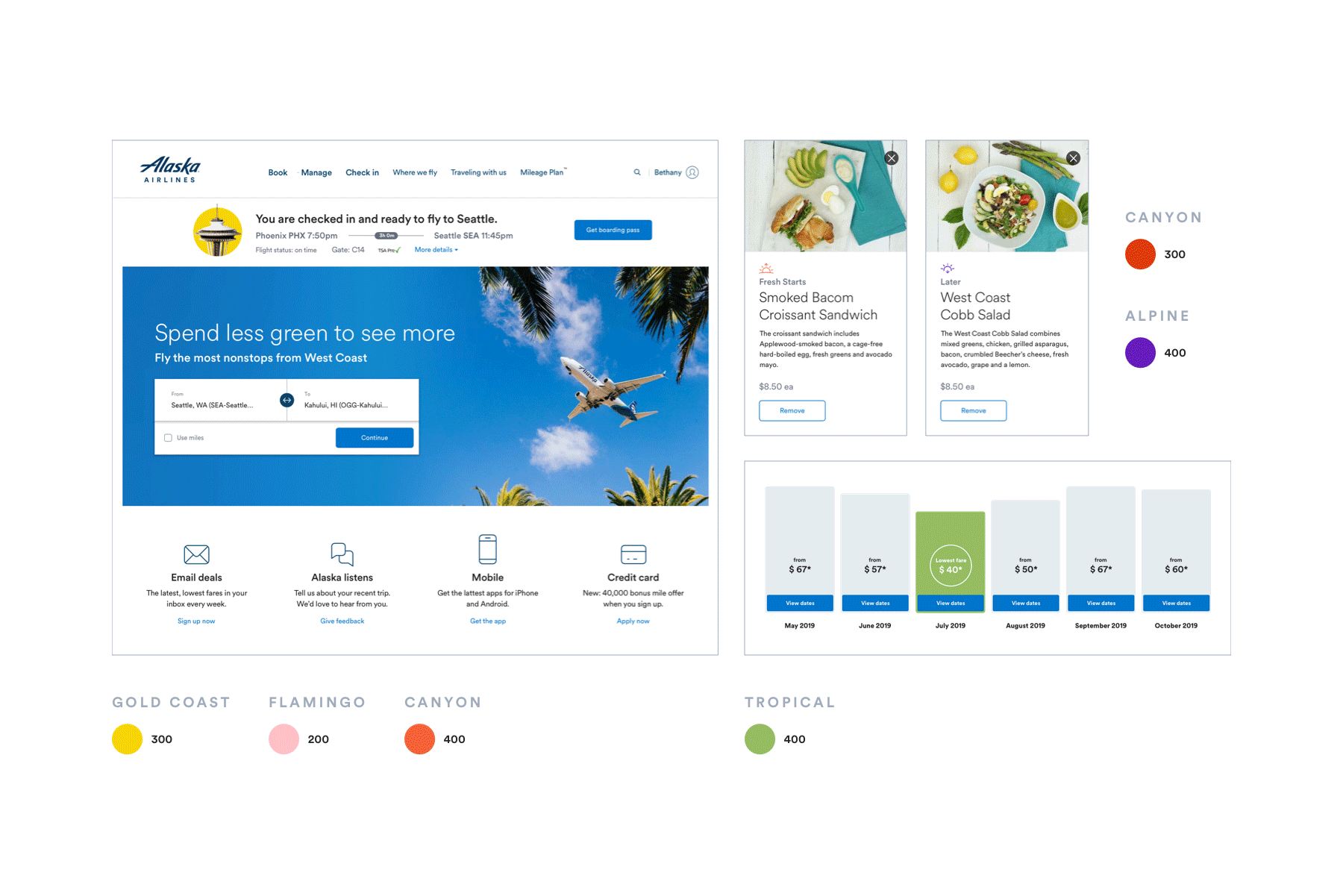
Foundations / Accent Colors + New Flows
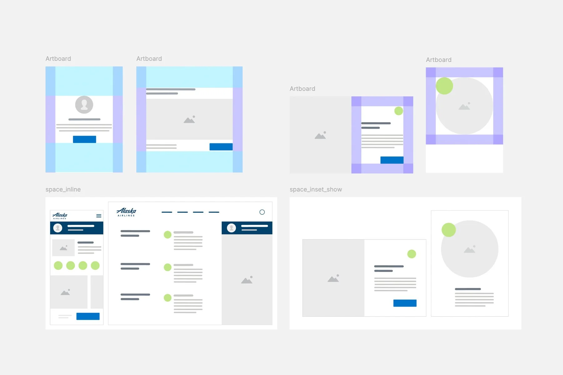
Foundations / Spacing

Documentation / Buttion Motion
Patterns / Merch Modal
My Role
As part of a small tiger team, I helped lead the creation of Auro, Alaska’s first unified design system. I served as both systems architect and cross-functional connector, translating strategy into tangible frameworks while building trust and alignment across product, engineering, and marketing. In just four weeks, we laid the foundation for a system that captured Alaska’s brand personality and adapted seamlessly across platforms.
Following the initial launch, I provided principal leadership and oversight of the system as it evolved. I led the systems team in scaling Auro into newly modernized, high-priority flows including flight search, booking, kiosk check-in, and self-serve support. This work included designing with flexibility for ongoing tech stack migration and ensuring the system remained usable and efficient as the product ecosystem matured.
Key Contributions
Co-created Auro’s foundational token structure, component library, and usage guidelines
Helped define the system’s design philosophy to reflect Alaska’s brand voice and warmth
Led alignment efforts across design, engineering, and marketing to drive early adoption
Supported engineering in establishing governance, documentation, and QA integration
Defined onboarding and support structures to maintain system quality and growth
Provided principal leadership of the system post-launch, guiding the team in evolving components across key flows like booking, kiosk, and self-serve
Ensured adaptability during a tech stack migration while maintaining design consistency and velocity
Impact
Created a cohesive design language that improved consistency and cross-team efficiency
Enabled rapid, brand-aligned responses to COVID and shifting travel behaviors
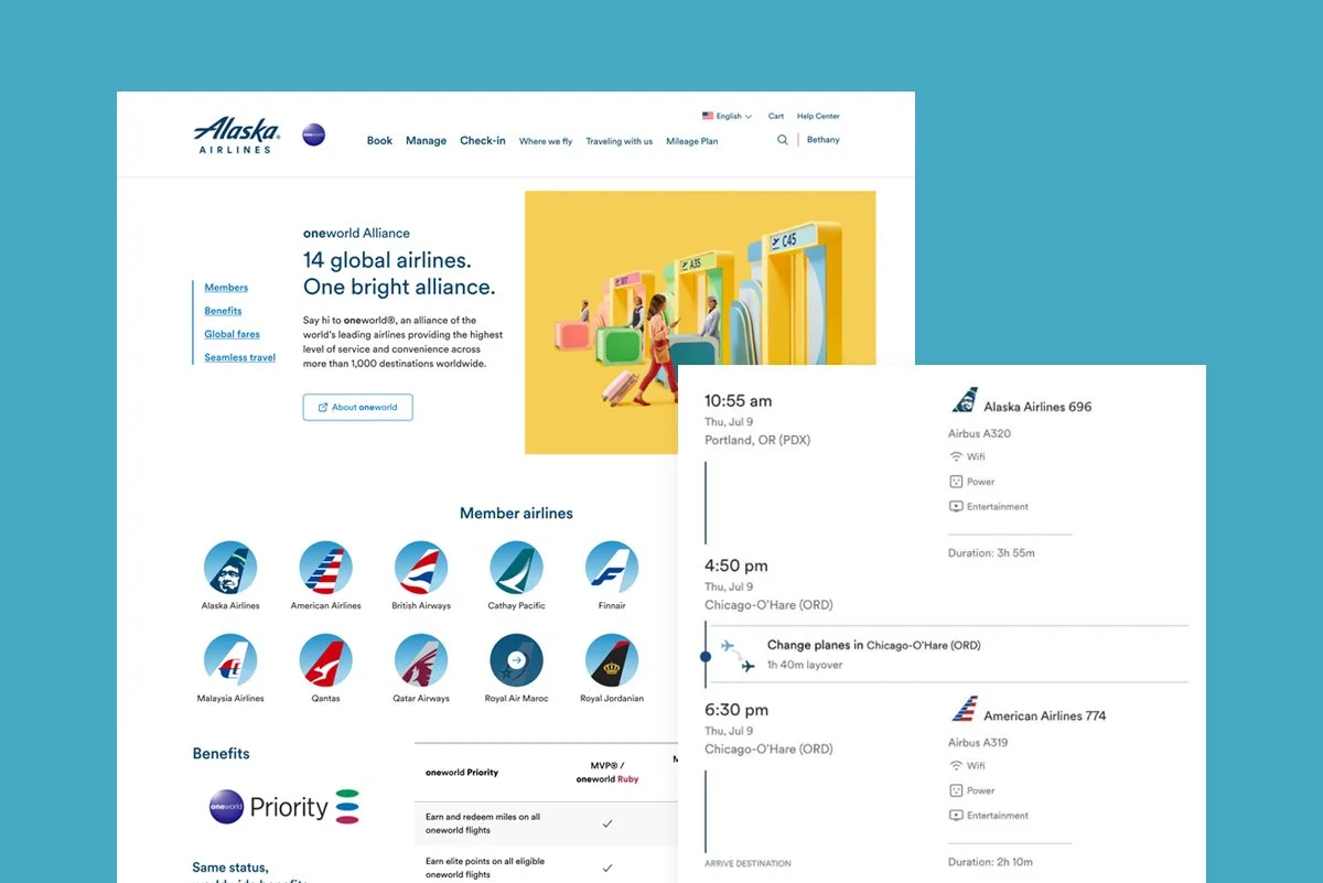
Supported oneworld alliance integration with scalable, system-driven UI changes
Set the groundwork for future expansion and internal tooling through reusable design logic
Accelerated modernization of booking and self-service flows through reusable components
Reduced reliance on custom design work during tech stack migration
Increased internal trust and adoption by aligning system with both brand and product strategy
Homepage Before

Homepage After

Flight Search Before
Flight Search After

Kiosk Before

Kiosk After
02 Content That Guides, Inspires, and Resonates
Overview
Content design has been a throughline in my product work, shaping not just what we say, but how users feel and what they do next. It's helped me evolve from a creative consultant to a trusted strategic partner across product, marketing, and brand. I use content to drive clarity, build trust, unlock adoption, and strengthen brand affinity. At Alaska Airlines, I developed a 3-tier tone framework to align our voice with guest needs, from transactional flows to brand storytelling, creating more confident and consistent user experiences across the journey.

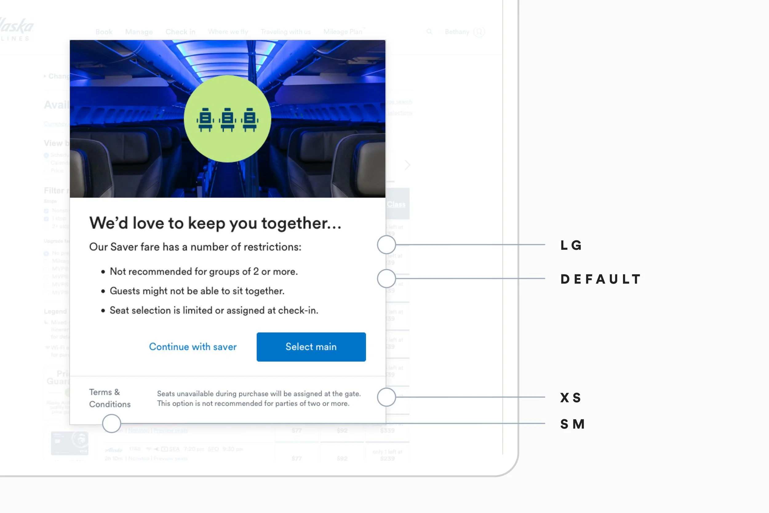
That framework didn’t just bring consistency, it gave us the flexibility to meet the moment. In merchandising, we embraced a celebratory, lighthearted tone to match the energy of travel. I introduced playful, culturally current language paired with visually engaging layouts that sparked curiosity, encouraged exploration, and created forward momentum in the flow. It showed we understood our travelers and could meet them with personality and warmth when the experience called for it. As Alaska integrated into the oneworld alliance, I helped evolve our tone to reflect a more global sophistication without losing the brand’s approachable personality. My contributions shaped internal tone documentation and surfaced across web, mobile, and kiosk experiences. I ensured we always met users with the right tone at the right moment so it was critical, we knew when to pivot. In transactional flows or during flight disruptions, we pulled back the charm in favor of clear, direct guidance with strong affordances and actionable next steps. That tonal shift became especially critical during the pandemic, when I partnered with brand and product teams to craft communications that helped guests navigate uncertainty. Our language evolved from alert to empathetic to empowering, supporting one of the strongest pandemic recoveries in the airline industry.

Flexible Merch Templates / Ideation

Destination Tile / Copy + Layout Tempalate
Content Guide / Information Architecture

Covid Hub / Information Architecture + UI
Confidence Module / Copy + Layout
Product Growth / Content Strategy + Visual Design

Global Brand Guidelines / Content & Strategy
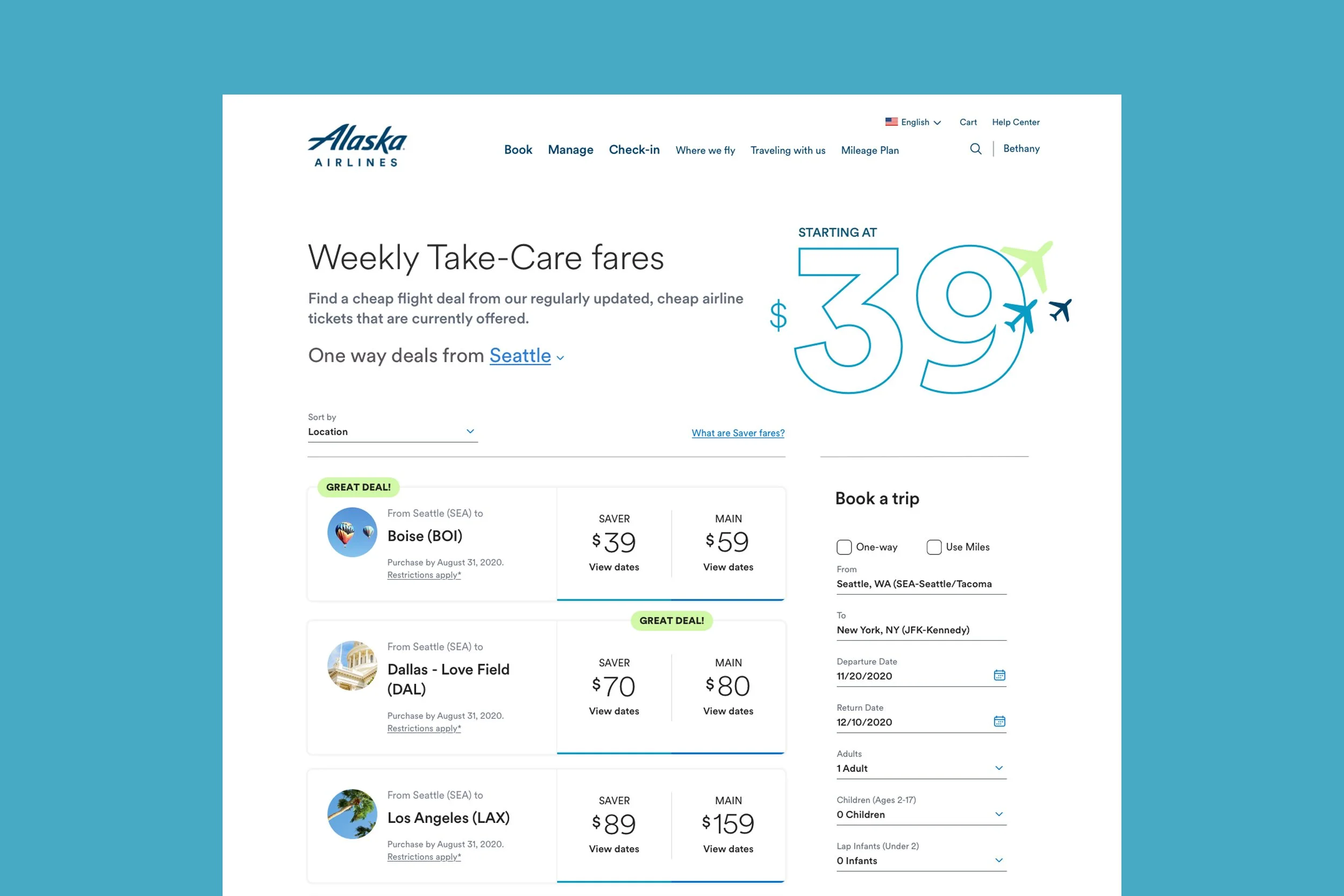
Sale Page Template / Content Strategy + UI

City Guides / Information Architecture + UI
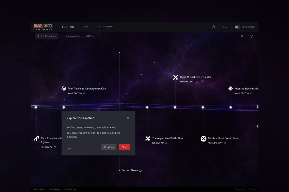
At Disney, I brought this same rigor and adaptability to CanonMap, a story-tracking and plot management tool used by Marvel and Lucasfilm. Designed to help teams uphold continuity across sprawling cinematic universes, CanonMap centralizes evolving plotlines, character arcs, and timeline logic. I worked closely with product and creative leads to craft interface copy and instructional guidance that mirrored how writers’ rooms actually communicate. We avoided overly technical or rigid language in favor of phrasing that felt natural, conversational, and intuitive. By anchoring the voice in the way storytellers already worked, we reduced friction, accelerated onboarding, and drove adoption across creative teams. The tone framework I developed helped the tool feel less like software and more like a trusted extension of the creative process, reinforcing usability in a fast-paced, high-stakes environment.
Onboarding Experience

Timeline Event Structure
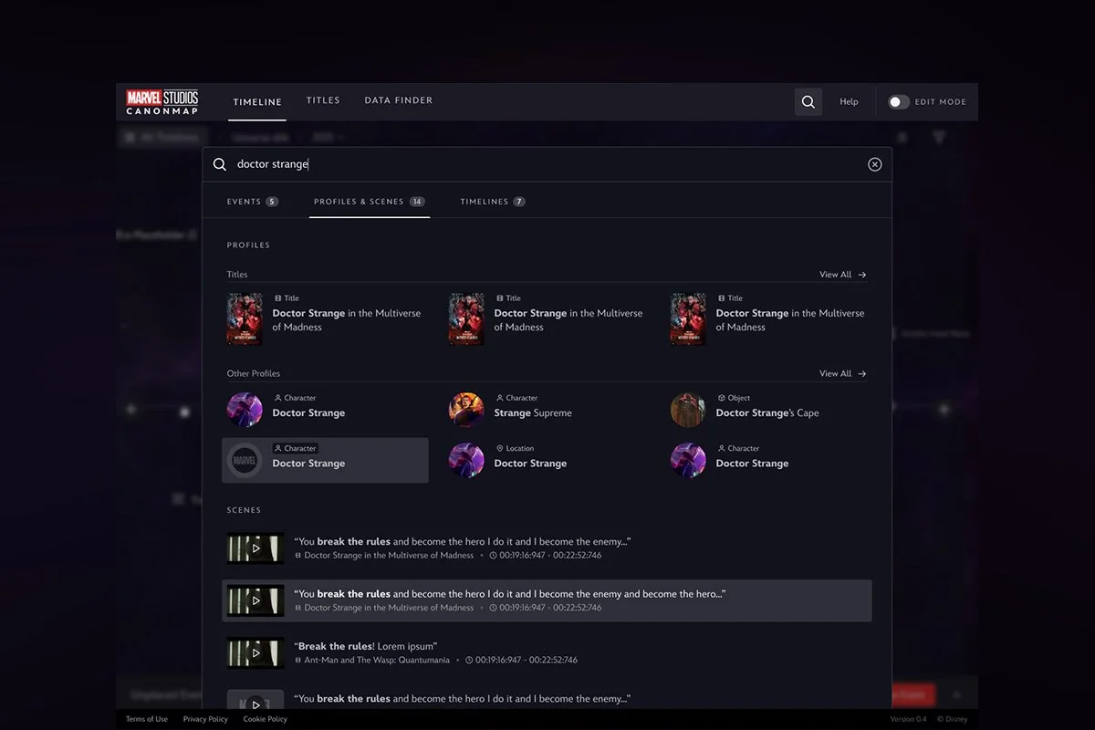
Advanced Search Categorization

Profile Page Structure

Micro-Interactions Guidelines

Character Tone Integration
03 Disney Studios Design System
The Opportunity
The Walt Disney Studios operates a complex and high-stakes production ecosystem, spanning legal, marketing, scheduling, and on-set workflows. Many of the internal tools were built in silos over time, resulting in fragmented experiences, inconsistent patterns, and friction in collaboration. With growing demand for scalable infrastructure and executive visibility, we needed a unified design system that could support both creative storytelling and enterprise-grade functionality.
My Role
As Sr. Manager of Design, I lead the development of thDesign System and UX strategy across the Walt Disney Studios ecosystem. I spearheaded the expansion of the system, overseeing its adoption across more than ten internal tools. I partnered directly with product leads, engineers, legal stakeholders, and studio executives to identify workflow gaps and ensure that design not only supported but accelerated their efforts. I also helped steer forward-looking initiatives, including integration into Vision Pro and XR formats, by ensuring the system was adaptable to new modalities without compromising consistency.
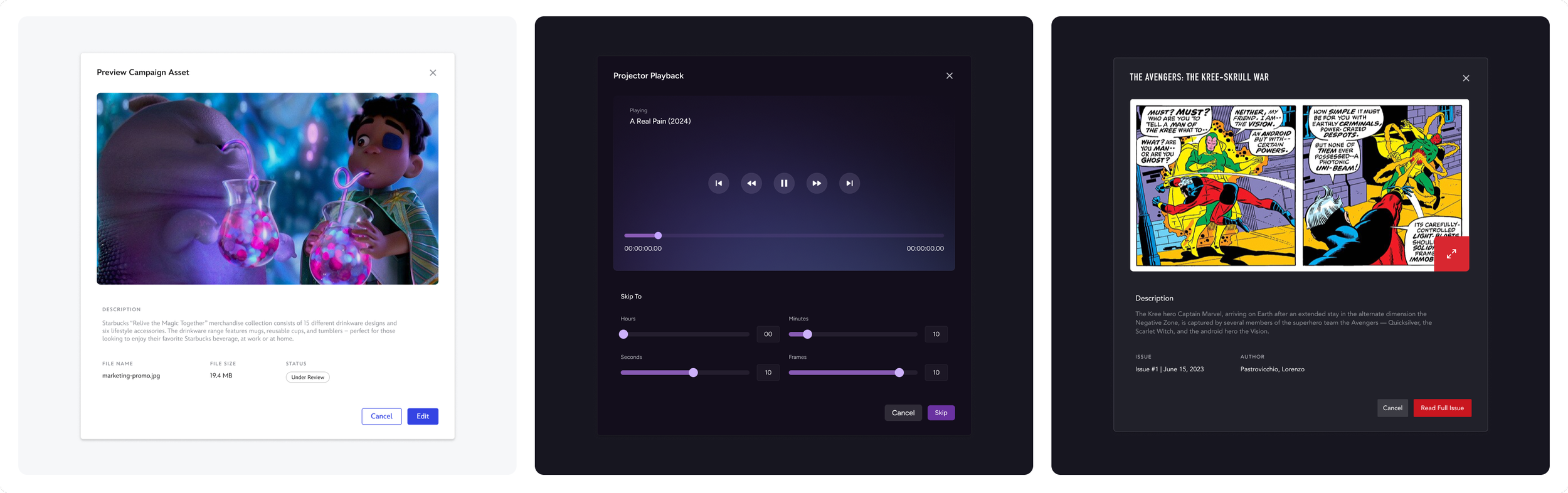
Modal Component

Table Pattern

Card Component
Key Contributions
Drove adoption of the CEL Design System across a fragmented enterprise tool landscape, unifying experiences across 10+ applications
Developed token architecture and usage patterns to streamline design and engineering collaboration
Introduced modular, flexible components to support both structured compliance flows and open-ended creative workflows
Created a governance and onboarding model to ensure ongoing scalability and system fidelity across teams
Led system expansion into XR and spatial computing formats in collaboration with innovation teams
Partnered with stakeholders across production, legal, and executive teams to align on shared UX standards and needs
Impact
Cut sprint timelines in half for large-scale feature development by replacing bespoke workflows with reusable components
Increased consistency and usability in tools used by on-set crews, legal teams, and studio leadership
Reduced rework and improved collaboration between design and engineering through standardized patterns
Strengthened confidence in the design team’s strategic value by aligning user needs with system-wide efficiencies
Positioned the CEL Design System as foundational infrastructure for future-facing initiatives including XR and AI tool integration

CEL System Docsite
04 Building Engaged + High Preforming Teams
Leadership & Philosophy
I’ve led teams of up to 15, spanning UX, UI, visual, systems, XR, artists, managers and writers. My leadership approach adapts to the skill sets and interests of each individual. I focus on building momentum without sacrificing thoughtfulness, guiding teams through changing priorities and new opportunities with a sense of clarity and trust.
I invest in relationships as a means to drive output. Whether it’s coaching someone through ambiguity, tailoring a project to match a designer’s strengths, or creating room for exploration in between delivery cycles, I work to make sure people feel seen, motivated, and connected to the work.
Organizational Impact
Sustained high team retention by cultivating a culture grounded in trust, transparency, and shared purpose
Strengthened morale and output by pairing people with work aligned to their passions and strengths
Coached through uncertain, fast-changing product landscapes while maintaining quality and pace
Built rituals and documentation that ensured onboarding, growth, and momentum never stalled
Positioned the design team as a trusted, strategic partner across disciplines and levels of leadership


MEET THE REAL REASON I GET UP (EARLY)
If you've made it this far, thank you. At this point, it's only fair you meet the real creative director behind it all: Sky, my 3-year-old Chihuahua-Pekingese mix and full-time boss.